Cappellini is a company that works in the processing and sale of vegetables goods.
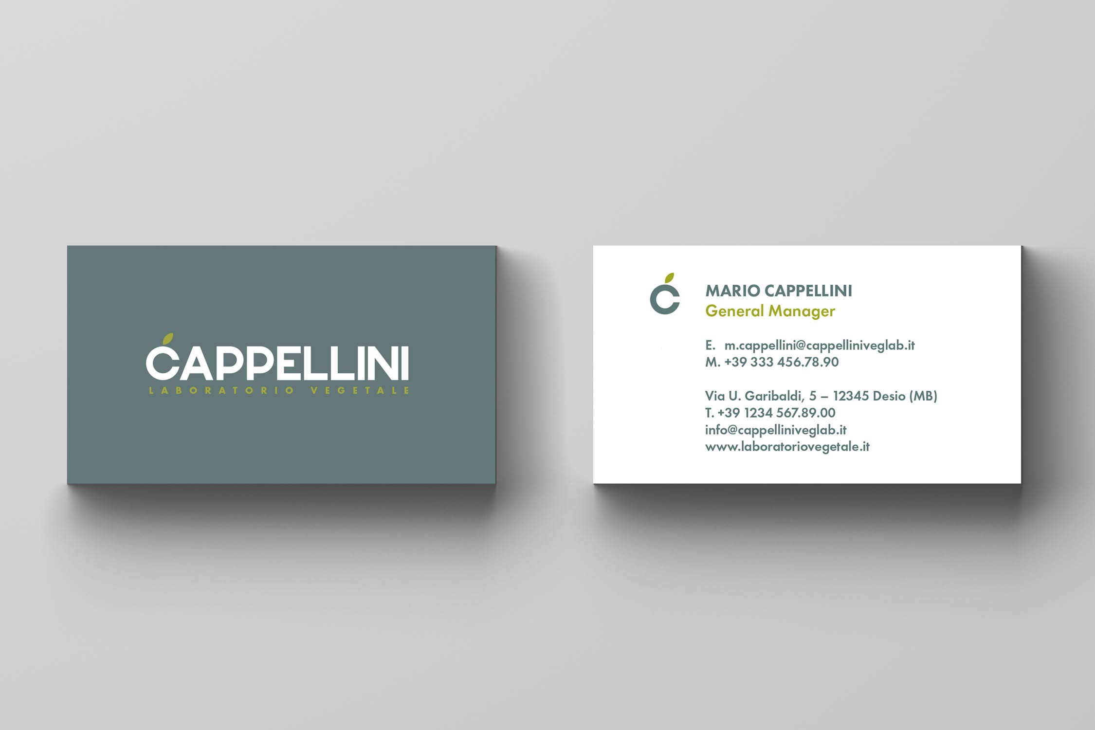
The brand identity was designed to give a contemporary, solid and rigorous look to a company that boasts 100 years of history and the experience of three generations.
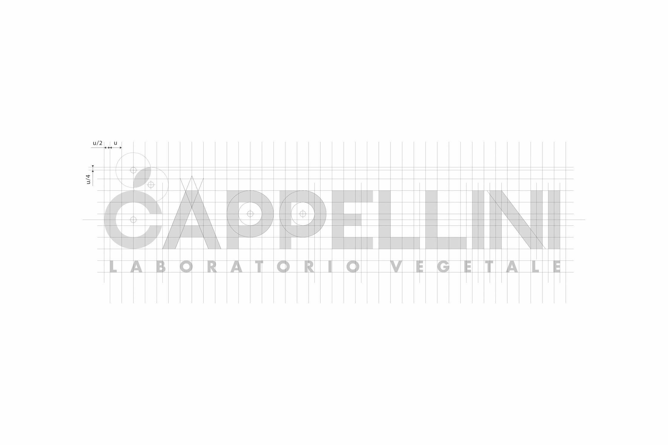
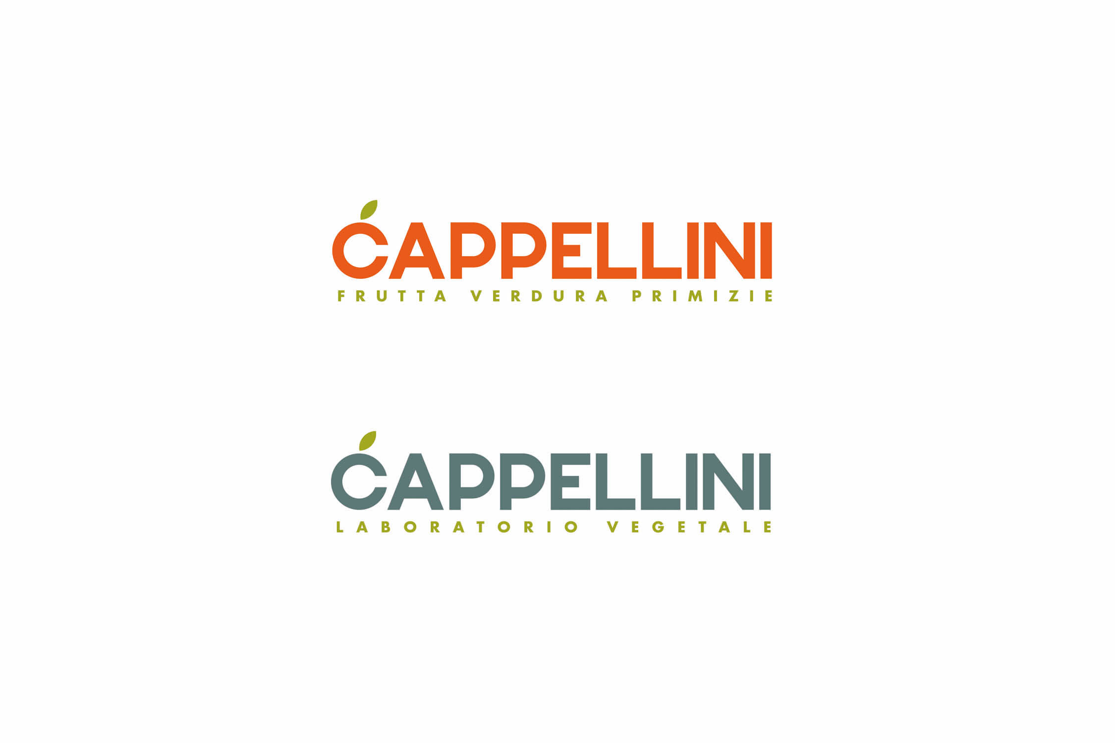
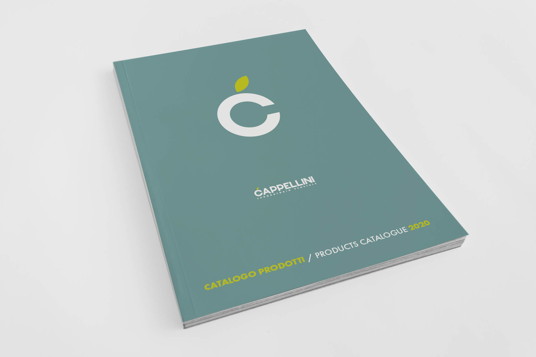
The logotype’s lettering is inspired by the roundness of the products of the earth, and the leaf-shaped icon unequivocally clarifies the sector in which the company operates. The logo has two variants, which are distinguished by colors and payoffs, and they define the two main divisions of the company.
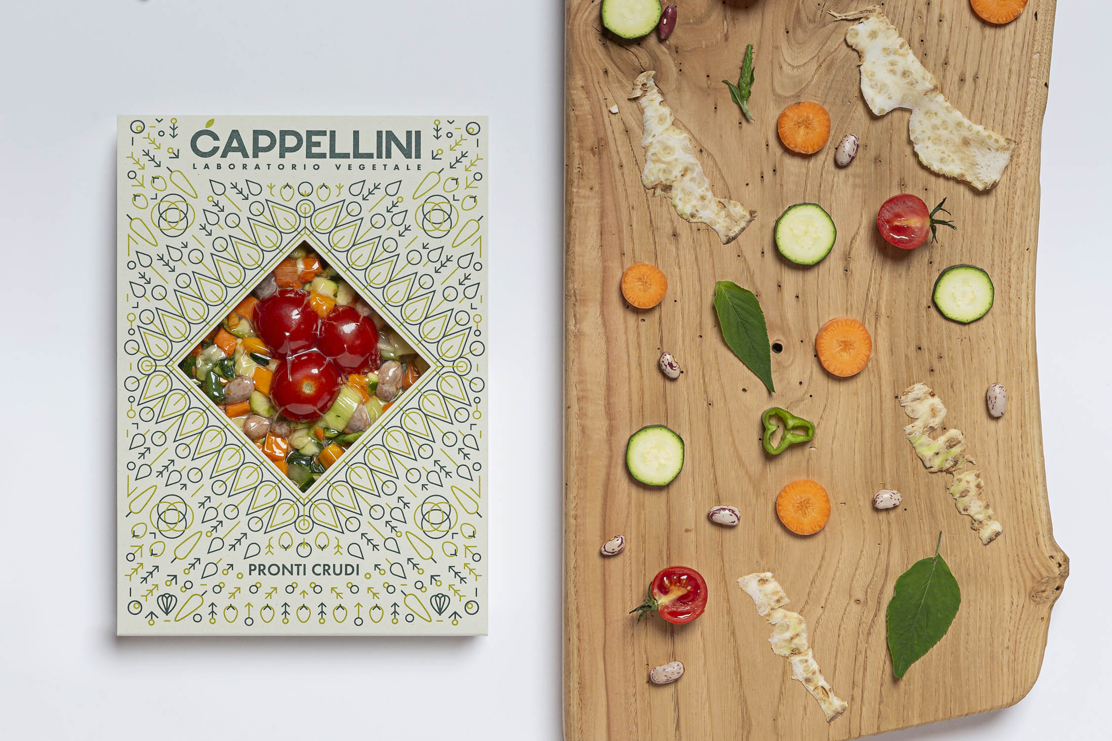
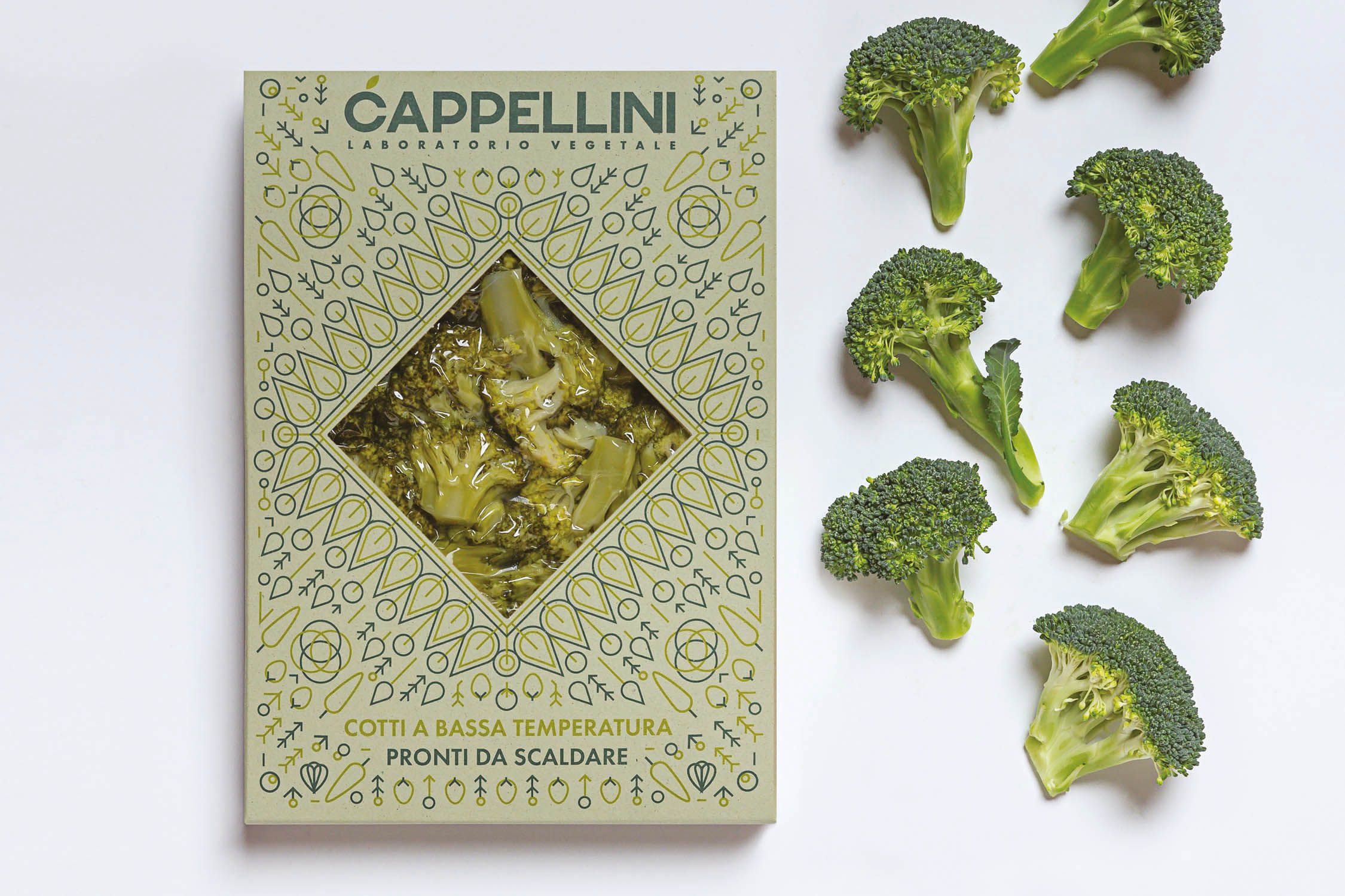
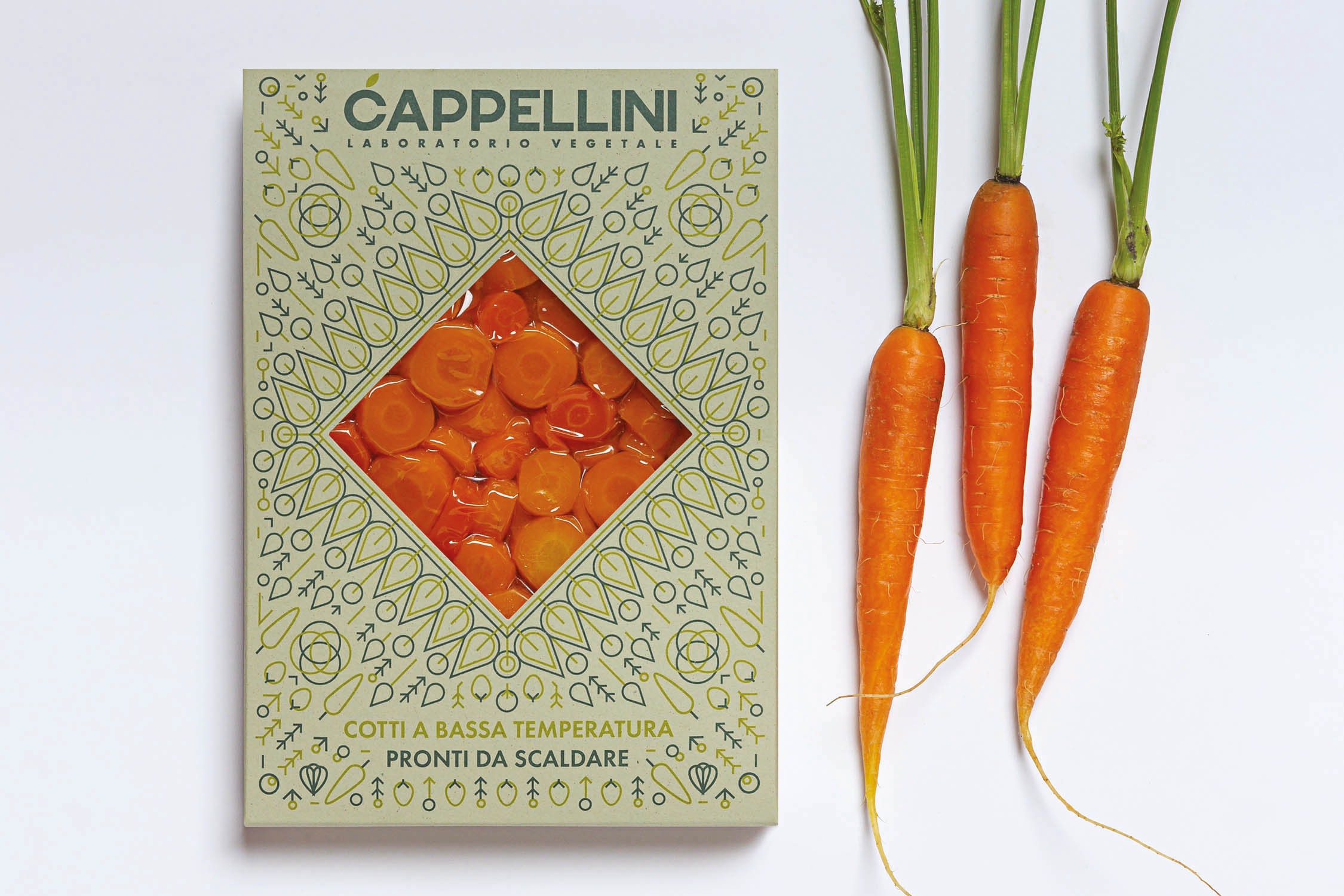
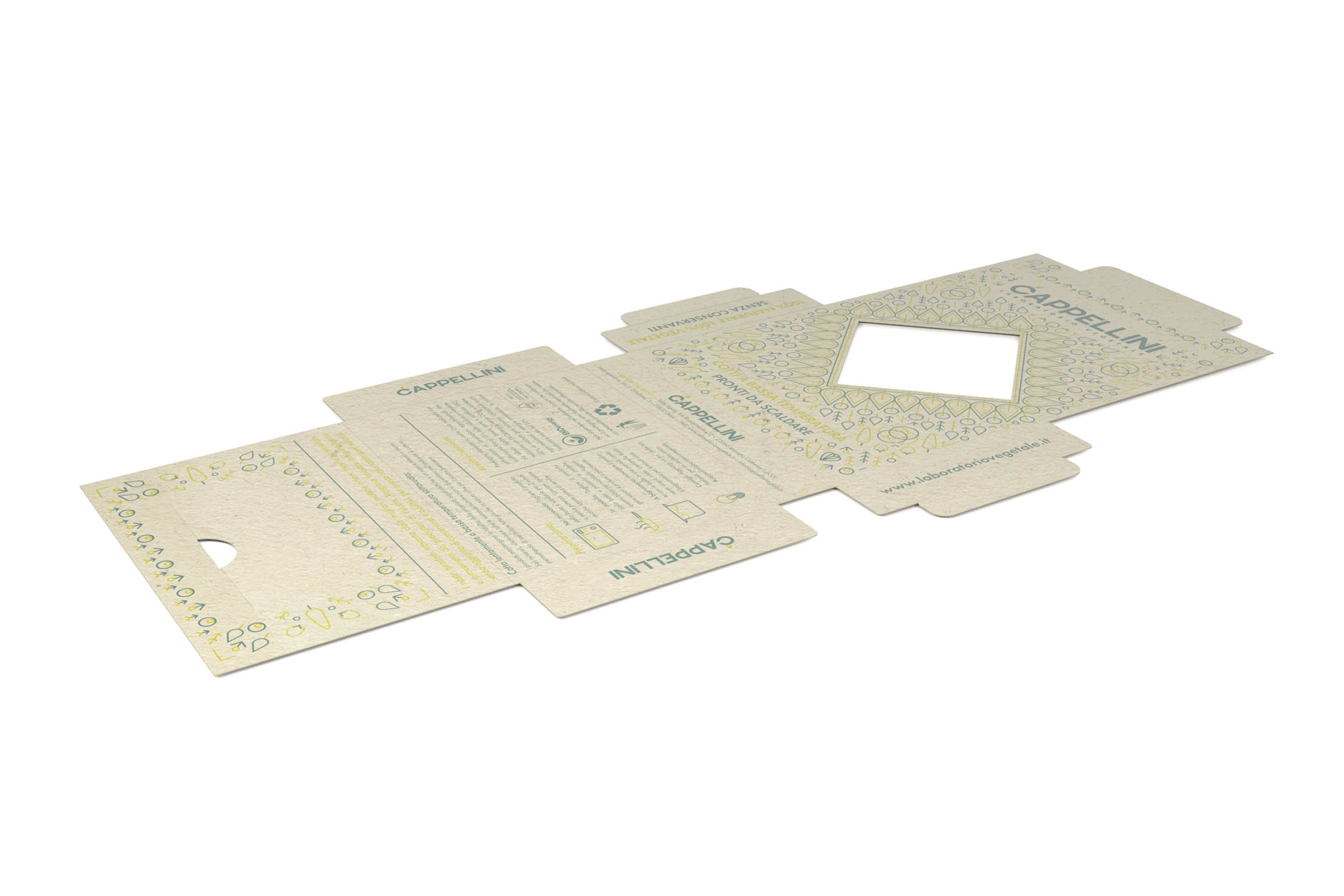
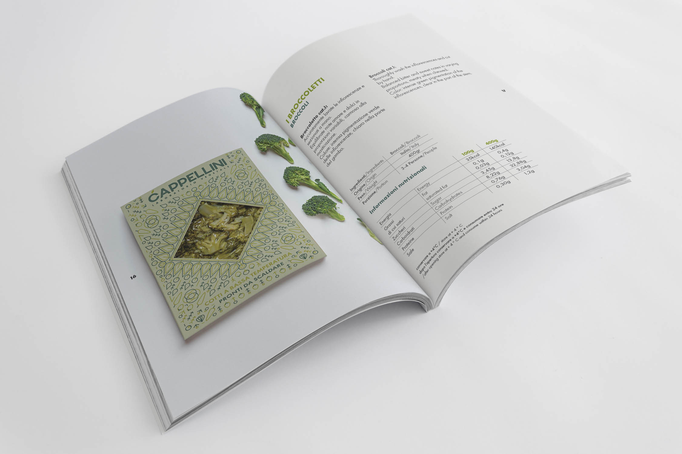
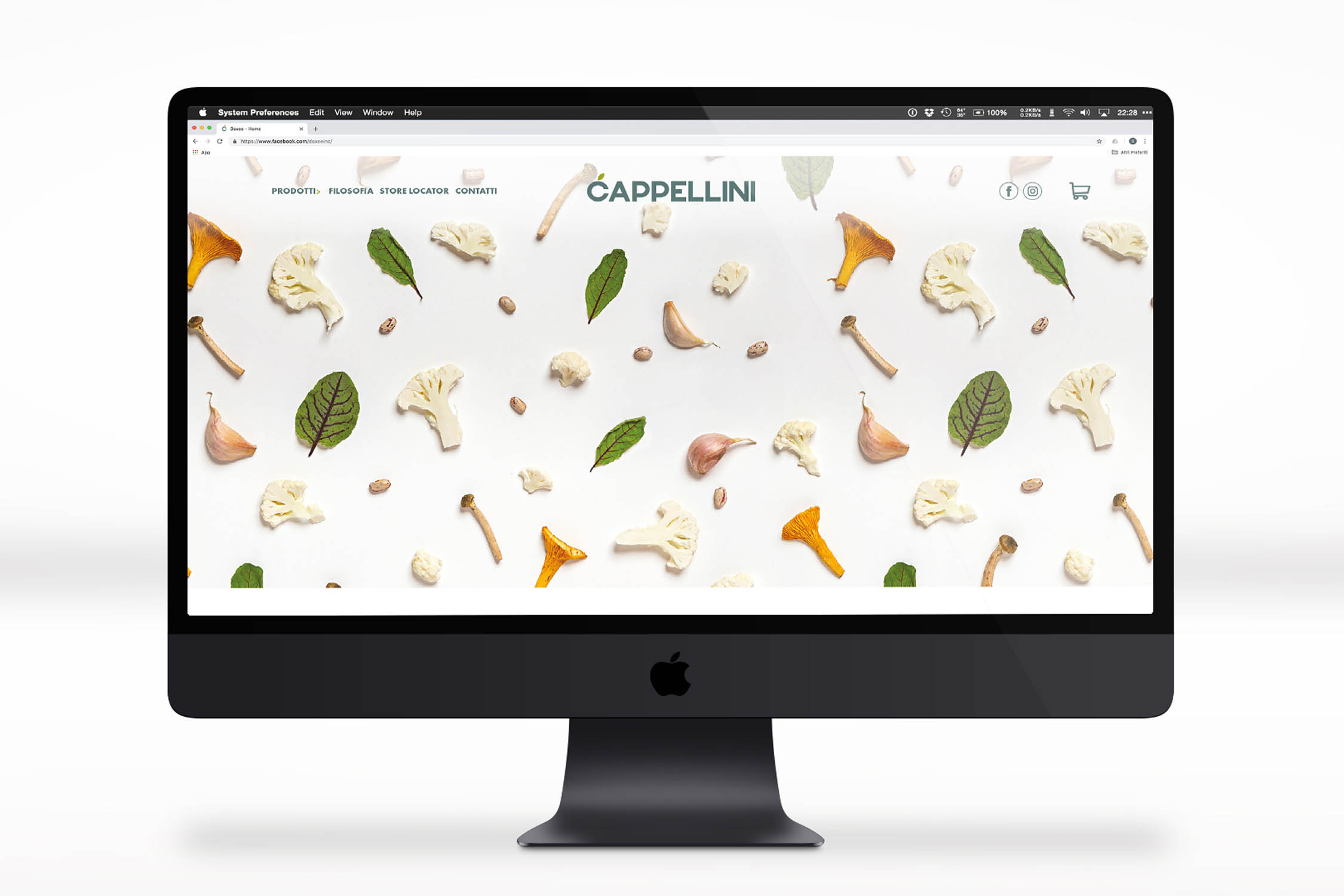
In addition to branding, the following were conceived and developed: packaging design (shape, layout, material and graphics), the art direction of photographs, and the company website (both graphic layout and user experience).
Client
Cappellini
Sector
Brand Identity
Year
2020
Disciplines
- Visual Design
- Graphic Design
- Brand Identity
- Packaging Design
- Web Design
- Catalogue Design
- Logo Design
Tag
- Brand Identity
- Packaging design
- Logo design
- Web design
- Fruit & Vegetable shop
- Sous Vide Vegetable
